This isn’t Freedom, This is Criminal
Originally published on Medium
As a child I was taught the sanctity of “Freedom of the press”, but where do we draw the line? This graph and others presented by this “press” organization are clear manipulations, transformations of ugly facts into fictional rosy narrative. Its not an accident, this had intent. Intent is where manslaughter becomes murder. Do we allow murderous press coverage?
Graphs are a communication tool. They are a fundamental in motivating concepts and ideas that span languages and cultures. We rely on them to guide our thinking, feelings, and actions. As such, there are conventions and practices that are common and subtle. It is hard to make high quality graphs, and minor mistakes happen all the time. The difference between mistakes and manipulation is intention.
When presenting a contentious issue, you would expect any mistakes made to be roughly split, some favoring one side of an argument, some favoring the other. In a manipulation, you expect to find a different distribution. In this graph I will explicitly call out 10 “mistakes” all of which contribute to minimization of the threat that COVID-19 poses to our country. The chance of this number of random mistakes being made in the same direction is less than 1 in 1,000, well past the standards for reasonable doubt.
Lets start with with the most obvious and egregious:

Mistake 1 — Vertical Scale Inconsistencies
Next to the two green bars I have added is the easiest to find “mistake” in this plot. Here, the bottom bar corresponds to a difference of 5 thousand cases, and the second just above it represents a difference of 15 thousand cases. Even steps in the scale of a graph is what makes the location and position of the data within the plot meaningful. This “mistake” makes it appear as if the first 5,000 cases happened more quickly, and decreases the perceived steepness of the curve, minimizing threat.

Mistakes 2-6 -Horizontal Scale Inconsistencies
Much as the vertical scale is a little…deformed…the horizontal scale is similarly unevenly spaced. Lets look at the spacing in terms of days:
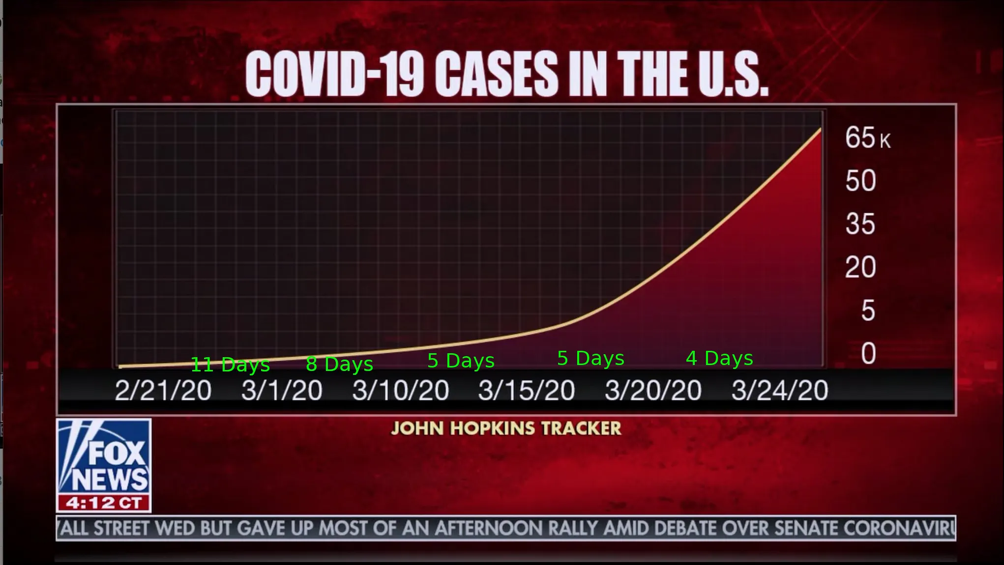
- 2/21 to 3/1 => 9 days (corrected! thank you!)
- 3/1 to 3/10 => 9 days
- 3/10 to 3/15 => 5 days
- 3/15 to 3/20 => 5 days
- 3/20 to 3/24 => 4 days
This has the effect of making the earlier cases appear more recent, and the more recent cases seem less sudden. The compound effect is, again, to make the overall trend of growth seem less sudden. In addition to these selection of dates, the locations of the dates themselves on the graph are similarly skewed.
Mistakes 7-8 — Label Locations
The last of the labeled dates is the 24th of March, you would probably infer that to mean that on that day, there were approximately 65,000 cases in the US. Sadly, this is the figure for the 25th of March. This shifting of the labels again favors the minimization of the ongoing impact by about ~18,000 cases.
Much as with the time axis, is rather hard to determine where to read the cases out on the vertical axis. If we take the centers of the numbers, we would be seeing a negative case count.
Needless to say, this again minimizes the apparent ongoing impact communicated by this figure.
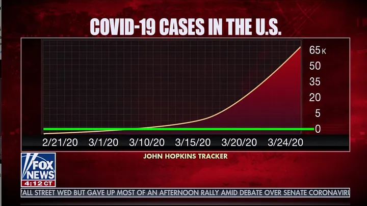
If we instead give this a generous reading suggesting we read off near the number bottoms, the overall figure doesn’t line up at all with the source data. Which brings us to …
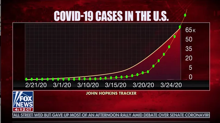
Mistake #9 — Mis-attribution of the source
At the bottom of this screenshot is the suggestion that this data might come from the “John Hopkins Tracker” [sic], one of the best maintained sources for aggregated corona virus reporting. In addition to their strong digital accountability, primary source tracking, version history, and support community, they present clear terms for how the data may be used. They state specifically that: “…use of the Website in commerce is strictly prohibited.” It would be a clear violation for a entity supported by commercials to use it in this way… I assume they are getting their data from elsewhere, after all the graphs just don’t line up:
The green dotted line is data overlaid from the Johns Hopkins Tracker.
If an engineer were to use this graph to show safety of a bridge they would go to prison. If a doctor or lawyer made a similar manipulation in testing or trials they would lose their licenses. If a teacher taught students to graph this way, they would be fired. However when these journalists, with a platform of millions, use this graph they aren’t murderers…they are protected by the first amendment.
I never anticipated having mixed feelings about freedom of the press, but I strongly encourage you to exercise your own freedom, and get your news elsewhere.